
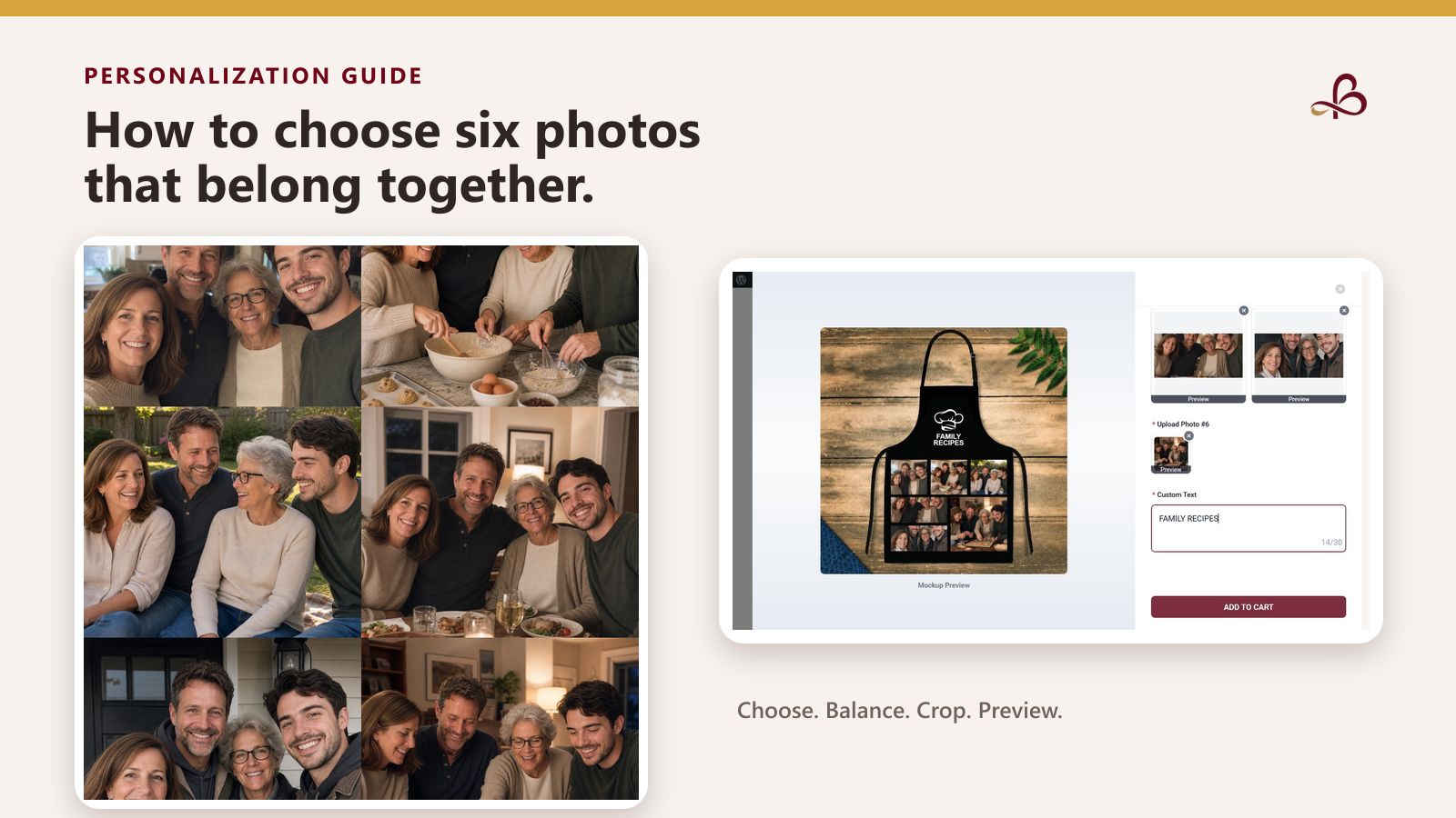
A six-photo collage can hold more of a story than a single portrait—but only if the images work together. Six unrelated favorites may each look good on a phone and still compete once they share one personalized design.
The goal is not to find six perfect photographs. It is to choose six clear, meaningful images that remain recognizable at a smaller size and feel connected when viewed together.
1. Decide what one story the six photos should tell
Start with a short sentence that explains the set. For example:
- The people who gather around the same table.
- Six moments from one family tradition.
- A child growing through six favorite stages.
- One person with the people who shaped them.
- A pet across six everyday moments.
This sentence is an editing rule, not public marketing copy. If a photograph does not support the same idea, save it for another project. A tighter theme usually creates a clearer collage than six individually strong but disconnected images.
2. Choose clear subjects before perfect backgrounds
Collage spaces are smaller than full-screen photographs. Prioritize images where the important person, pet, or moment is easy to identify.
Look for:
- Faces that are in focus and large enough to recognize.
- Even lighting across the subject.
- Space around heads, ears, hands, or other details that should survive a crop.
- Original image files when possible, rather than screenshots or heavily compressed downloads.
- Limited text, stickers, watermarks, or interface elements inside the photograph.
A busy background can sometimes be cropped. A blurred face cannot be restored simply by making the file larger.
For a deeper quality checklist, read How to Choose the Best Photo for a Personalized Gift.
3. Mix close views with wider moments
Six nearly identical headshots can feel repetitive. Six distant group photographs can make every face too small. A useful starting mix is:
- Two close portraits.
- Two medium-distance photographs with some setting visible.
- One wider group or place-based moment.
- One detail that carries meaning, such as hands preparing a recipe, a familiar kitchen, or a pet in a favorite spot.
This is not a fixed formula. It is a way to create visual rhythm while keeping the people or pets recognizable.
4. Balance color without trying to make every image match
Photographs from different years and devices rarely share the same color or lighting. They do not need to become identical, but a few checks can prevent one frame from overwhelming the rest:
- Avoid placing all the darkest images on one side of the design.
- Spread very bright photographs across the layout.
- Check whether one highly saturated image pulls attention away from the other five.
- Prefer natural corrections to heavy filters that change skin, fur, clothing, or important details.
If a filter is offered in the customizer, compare it across the full set. A treatment that helps one photograph may reduce detail in another.
5. Crop for the actual layout, not the camera roll
A photograph that looks balanced by itself may be cropped differently inside a product template. Keep the important subject away from the extreme edge, and leave enough surrounding space for the layout to reposition the image.
Do not permanently crop every source file before seeing the customizer. Preserve the originals, then make a separate edited copy if the product needs a tighter composition.
6. Put the strongest image where attention lands first
If the customizer shows a clear reading order or dominant image area, use the photograph that best explains the set in that position. It might be the clearest group picture, the central person, or the moment that makes the other five images understandable.
When every slot is equal, use contrast and expression to choose the anchor. The strongest image is not always the most emotional one; it is the one a viewer can understand quickly at the final printed size.
7. Keep custom text short enough to support the photographs
Text should add context without competing with six images. A family name, a brief phrase, a year, or a few meaningful words will usually remain easier to review than a long sentence.
Before ordering, check:
- Spelling, punctuation, and capitalization.
- Names and dates.
- Whether the text is legible against the design.
- Whether a line break changes the meaning.
- Whether the phrase still feels appropriate for everyone represented.
8. Review the live preview as a whole
The Personalized Photo Apron with Custom Text & Family Photo Collage accepts six photos and custom text. Its public customizer can render an on-screen product preview after the images are uploaded and cropped.
Use that preview to check the relationship between all six photographs—not only whether each upload succeeded. Look for repeated images, accidental empty areas, cropped faces, unreadable text, and a single frame that visually dominates the entire design.
A live preview is a digital representation, not a manufactured sample. Screen color, apparent brightness, source-photo quality, and the finished product can differ. The preview is most useful as a placement and composition check.
Final six-photo checklist
- All six images support one recognizable story.
- The important subjects remain clear at a smaller size.
- Close, medium, and wider views create useful variety.
- Bright and dark images are distributed across the layout.
- No face or meaningful detail is cut off.
- Every uploaded image is unique and in the intended position.
- Custom text is short, legible, and spelled correctly.
- The final preview looks balanced as one design.
The best collage is not the one with the most dramatic photographs. It is the one where six separate moments become easy to understand together.
Start a six-photo personalized apron or browse personalized gifts.